

Templates that survive the parser.
A resume that looks beautiful and extracts as gibberish is worse than a plain one. Every template here is designed backwards from what an applicant tracking system reads, and every preview below is the real rendered output.
Six layouts, one set of rules underneath.
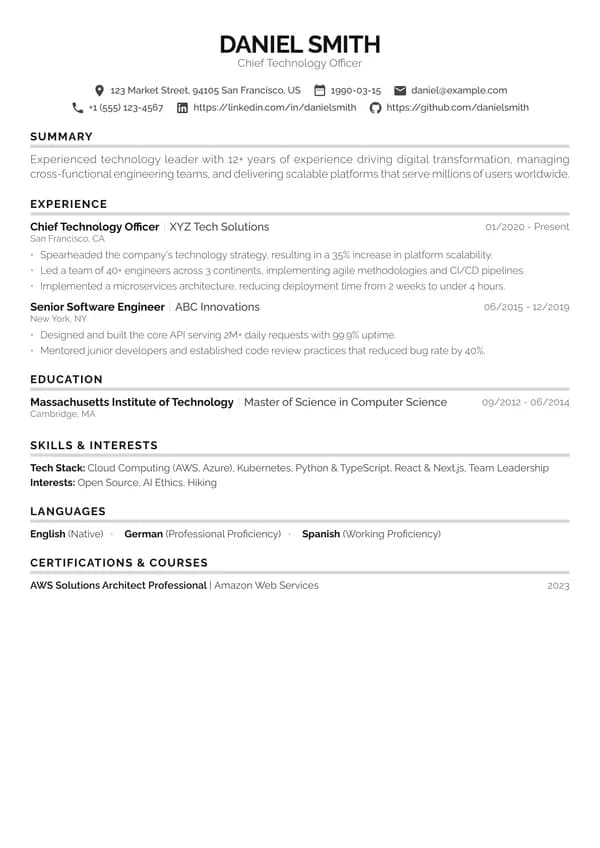
Harvard
Clean single-column layout with bold section underlines and compact spacing
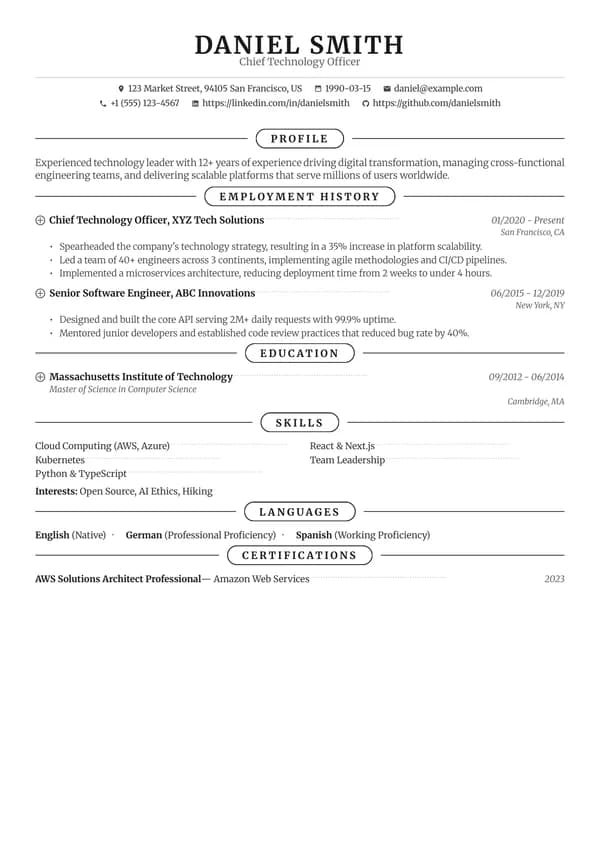
Classic
Traditional serif design with elegant section borders
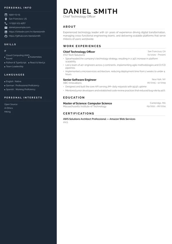
SidebarTwo column
Two-column layout with dark sidebar for contact and skills
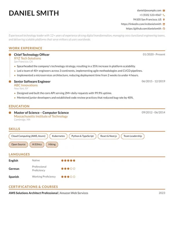
Executive
Warm copper accents with timeline layout and skill badges
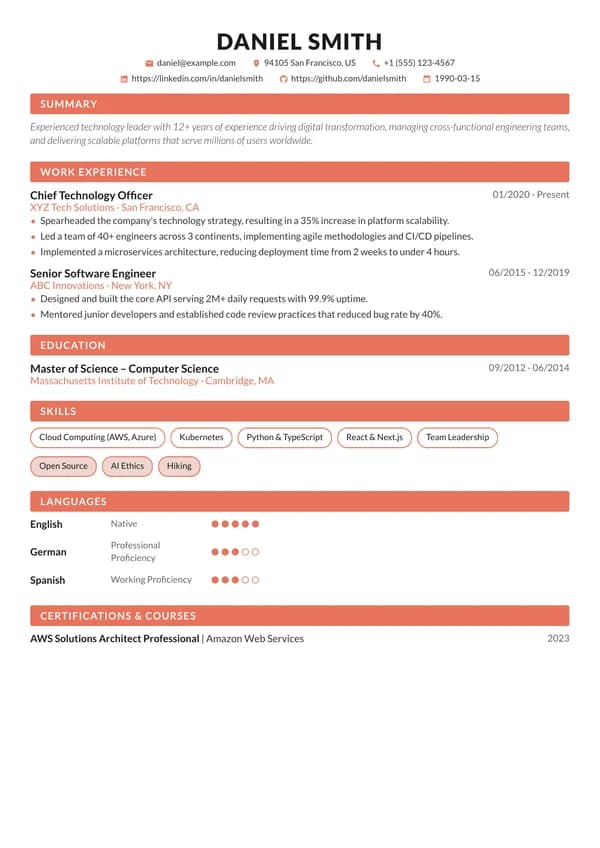
Vivid
Coral accents with circular photo and filled section headers
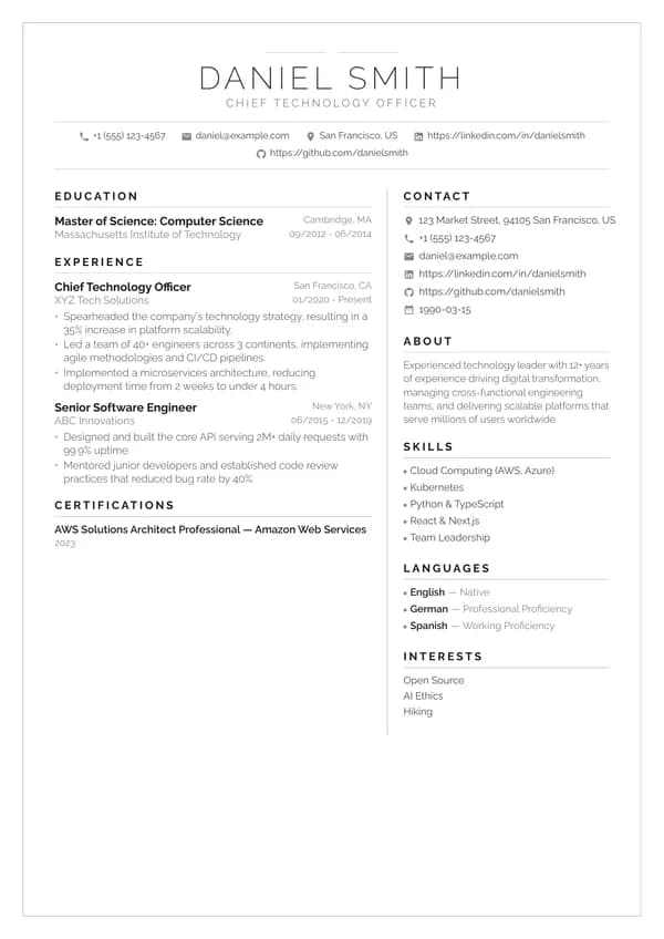
FramedTwo column
Monochrome design with page border, centered header, and two-column body
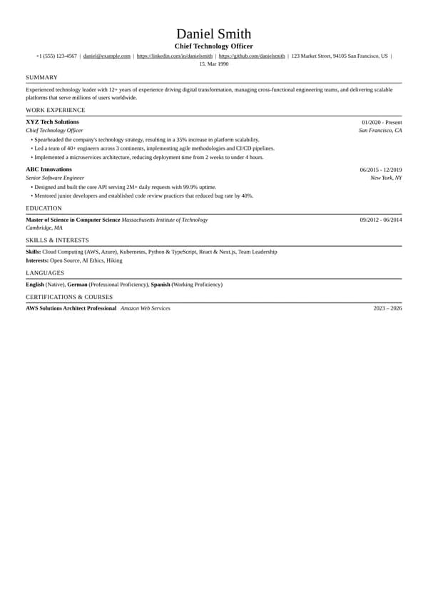
Jake
The classic tech resume: Times-style serif, centered name, ruled section titles, two-row entries, black and white
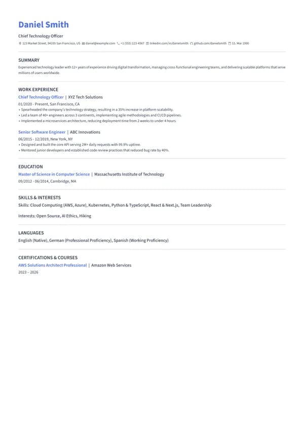
Modern
Clean sans-serif with a colored name and roles, contact icons and thin lines between sections
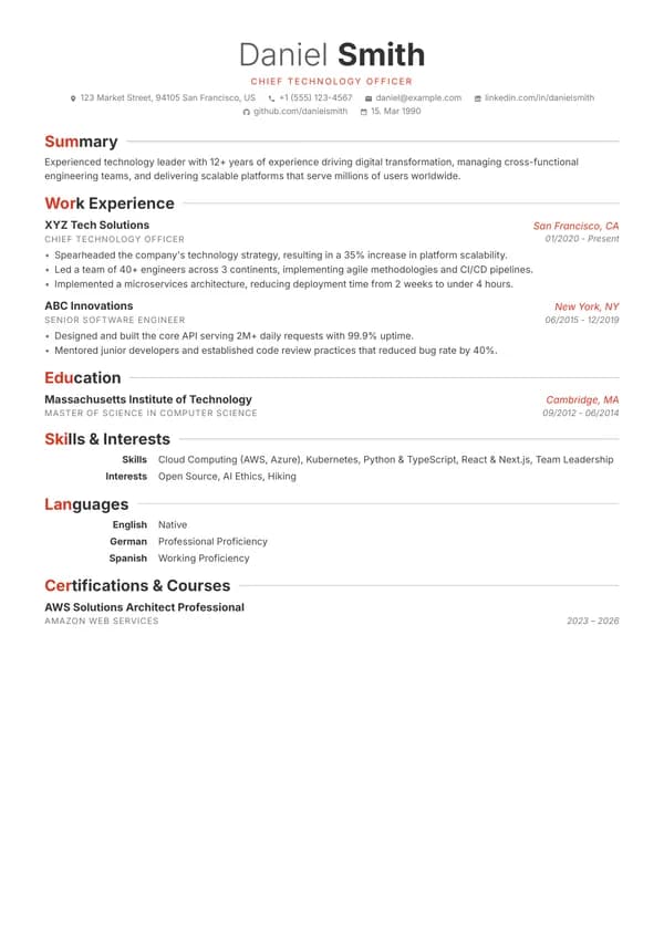
Accent
Centered light and bold name, colored section initials with hairlines, two-row entries and a skills table
Four constraints. No exceptions.
Real text, never images
Every word is a selectable text layer in the exported PDF. Text baked into a graphic extracts as nothing, which is the single most common way a resume arrives at an employer blank.
Standard section names
Experience, Education, Skills. Parsers map those to database columns; "Where I've Been" goes unclassified and the content under it is effectively invisible to recruiter search.
One readable column order
The two-column layouts here keep a linear reading order underneath, so a sidebar of skills doesn't get interleaved into the middle of a job description during extraction.
Dates that survive extraction
Roles carry machine-readable start and end dates in a consistent position, so the work history reconstructs in the right order instead of collapsing into one undated block.
The layout is only half of it. The other half is what the document says: see why resumes get rejected and the glossary entry on applicant tracking systems.
Matched to the resume, not bolted on.
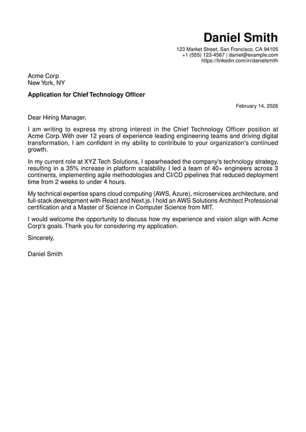
Professional
Formal layout suitable for traditional industries
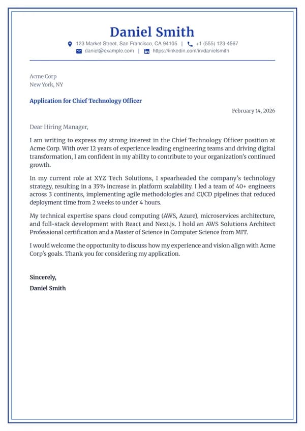
Double Frame
Elegant double blue border with serif typography
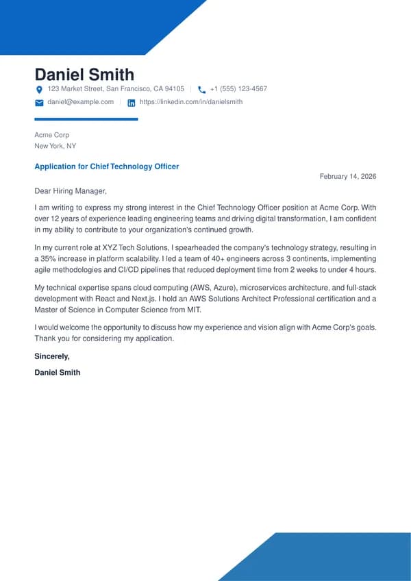
Geometric
Blue geometric corners with bold accents
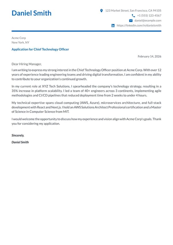
Modern
Blue accent header with split name and contact layout
A US resume and a German CV are not the same document.
Photos, dates of birth, and nationality are conventional on a German or French CV and are deliberately excluded from a US resume, where they create discrimination exposure the employer doesn't want. Page-count expectations differ too: one page is a US norm and reads as thin in much of Europe.
That's why the templates carry a photo slot that can be off as easily as on, and why Jobiz applies the destination country's conventions when it generates a tailored version rather than making you keep separate files in sync by hand.
Pick one. It fills itself.
Upload a resume or import your LinkedIn once. From then on every template renders from the same profile, and a tailored version for a specific posting is one click, reviewed by you before it goes anywhere.